Represents a button with an arrow on it pointing right, which has some elements of interactivity. It is achieved through the ability of the component to change its color and play sound when the mouse cursor is positioned or clicked on it. Label on the button may have 3D effects. It is also possible to place above the label a small image icon.
After a right mouse click, window of Additional Properties of
a component will open,
where it is possible to set label font, its size and style (bold, italic
or underlined), also to set font color and to create label text to be
placed on the button. It is also possible to choose button color here.
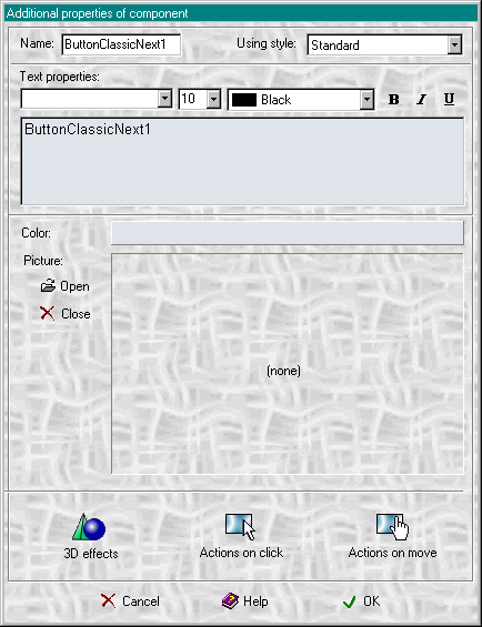
With the help of Open and Close buttons, user may decide to install or not to, a small image icon that will be placed on the component above the label.
When the 3D effect button is clicked, the same-named window will appear
where it will be possible to set how the text will be displayed on the
component.
In general it may be displayed as lowered, outlined, raised or shadowed
one. For the Text with outline an outline color can be chosen as well
as Shadow color can be chosen for the text with shadow.
The given program also enables users to rotate text to any degree towards horizontal.
In Additional Properties window two more buttons are active: Actions on click and Actions on move, meaning that a component may react to the events.